
Mastering Website Navigation: Essential Patterns for Exceptional User Experience

Key Takeaways
- Choosing the appropriate navigation pattern enhances user experience and engagement.
- Different navigation styles suit various website structures and user needs.
- Implementing best practices in navigation design can increase conversion rates.
Table of Contents
- Horizontal Navigation Bars
- Dropdown Menus
- Hamburger Menus
- Mega Menus
- Bottom Navigation Bars
- Breadcrumb Navigation
- Sidebar Navigation
- Best Practices for Implementing Navigation Patterns
Effective website navigation forms the backbone of an enjoyable user experience, ensuring visitors can effortlessly discover what they need and move through your site without frustration. Selecting the right navigation UI strategy not only streamlines content discovery but also impacts engagement and conversion metrics for both small and large websites.
Every visitor expects to access key information with minimal effort, whether browsing on a laptop or a smartphone. The choice and execution of your site’s navigation structure can determine whether users remain engaged or leave quickly, underscoring the importance of user-focused navigation design. Understanding the available navigation patterns, their ideal use cases, and best practices is essential for optimal usability.
Navigation systems help organize information flow, visually guide users, and support accessibility. Different patterns offer distinct advantages based on your site’s complexity and intended audience. Adopting navigation models tailored to your users and content keeps experiences seamless across platforms.
Committing to a smart navigation approach can also improve your website’s discoverability and search performance, boosting retention and satisfaction rates. High-caliber navigation isn’t just about placement or style; it combines clarity, functionality, and adaptability through thoughtful pattern selection and implementation.
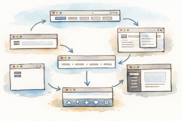
Horizontal Navigation Bars
Horizontal navigation bars, usually positioned at the top of a webpage, are a fundamental navigational pattern. They ensure main site categories are visible and accessible, benefiting sites with a concise set of top-level pages. This navigation style fosters a familiar browsing environment and helps orient users from their moment of arrival. Horizontal navigation is particularly appropriate for corporate or brochure-style websites with clear, limited categories.
Dropdown Menus
Dropdown menus extend the horizontal navigation bar, allowing access to multiple subcategories when a primary category is hovered over or clicked. This pattern prevents the main navigation from overcrowding, making it ideal for content-rich sites like educational portals or online stores. Dropdowns enhance user efficiency by shortening the navigation path to deeper site areas and helping visitors quickly locate specific information.
Hamburger Menus
The hamburger menu, characterized by three simple lines, is common on mobile and responsive sites. It preserves precious screen space and hides navigation elements until needed. While the hamburger pattern enhances visual cleanliness, it is best reserved for secondary navigation elements or less-frequently used options, as some users may overlook hidden content. Understanding when and how to use the hamburger menu is critical for maintaining engagement on mobile interfaces. For more insights on navigation usability in mobile settings, see this Nielsen Norman Group article.
Mega Menus
Mega menus display an extensive grid of navigation links, often including images, icons, and subcategories within large sites. E-commerce companies, universities, and news organizations frequently use mega menus because they allow users to view the site’s breadth of content in a single view. Proper categorization and clear visual hierarchies within mega menus are vital to prevent information overload. The mega menu’s organization simplifies navigation for users seeking quick access to numerous topics or products.
Bottom Navigation Bars
Fixed at the bottom of the screen, bottom navigation bars are optimized for mobile use. They keep primary navigation actions within thumb’s reach, which is particularly advantageous for apps or mobile-first websites with up to five core destinations. This ergonomic approach enables one-handed navigation and reduces friction for mobile users. For implementation guidelines and examples, visit Google's Material Design resources.
Breadcrumb Navigation
Breadcrumb trails provide a horizontal pathway that shows a visitor’s position within the site’s structure. Displayed near page headers, breadcrumbs are especially effective for websites with deep hierarchies, such as retail or informational sites. This navigation pattern enhances findability, enables effortless backtracking, and reinforces user confidence in their interactions with complex sites.
Sidebar Navigation
Sidebar navigation uses a vertical menu anchored on one side of the page, often seen in blogs, SaaS dashboards, and content-driven platforms. It is valuable for presenting a range of navigation options without overwhelming the main content area. Sidebars may be static or collapsible depending on the application, providing flexibility for desktop and tablet layouts. This structure encourages exploration for users seeking in-depth site features or resources.
Best Practices for Implementing Navigation Patterns
- Consistency: Navigation systems should remain the same across all pages. Inconsistencies can confuse visitors and disrupt the user journey.
- Simplicity: Limit menu items and display only the most important sections to avoid cognitive overload.
- Clarity: Use direct, descriptive text for navigation elements to ensure users always know what to expect when clicking a link.
- Responsiveness: Ensure navigation adapts to various screen sizes and remains usable across all devices.
- Accessibility: Navigation must be usable for everyone, including individuals with disabilities. Clear contrast, keyboard navigation, and appropriate labeling are essential. Learn about accessible navigation recommendations at the W3C Web Accessibility Initiative.
Comprehensive navigation design is essential for promoting exploration, boosting user satisfaction, and achieving website goals. By selecting suitable navigation patterns and following recognized best practices, websites can create an intuitive digital space where all visitors feel welcomed and empowered to engage with content.


